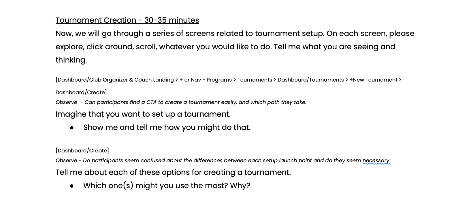
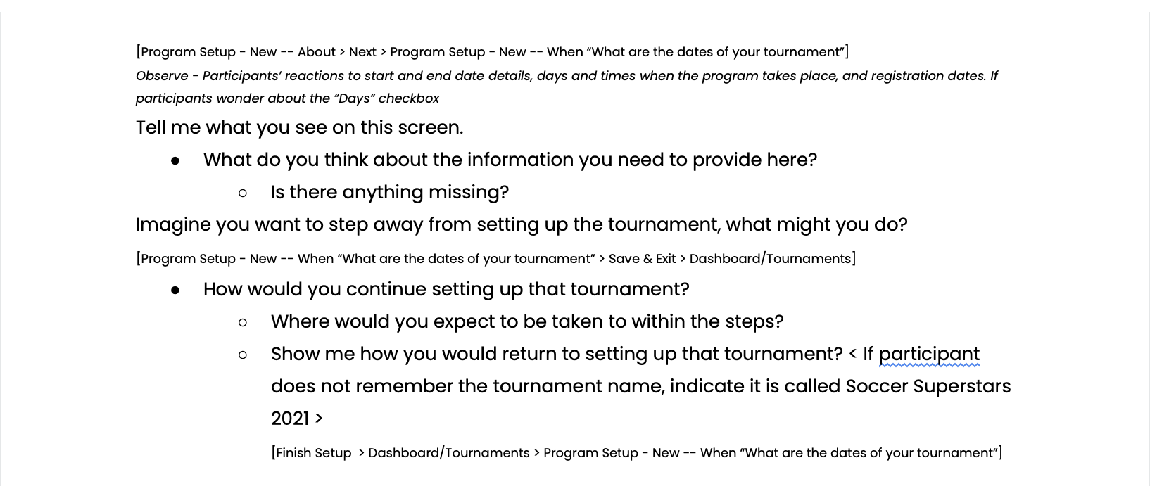
THE PROBLEM
LeagueApps is a youth-sports management platform designed to help organizers create, schedule, and manage their programs. The platform provides an end-to-end solution, whereby after organizers create their programs, they can publicize them on the web for parents to find and register their children.
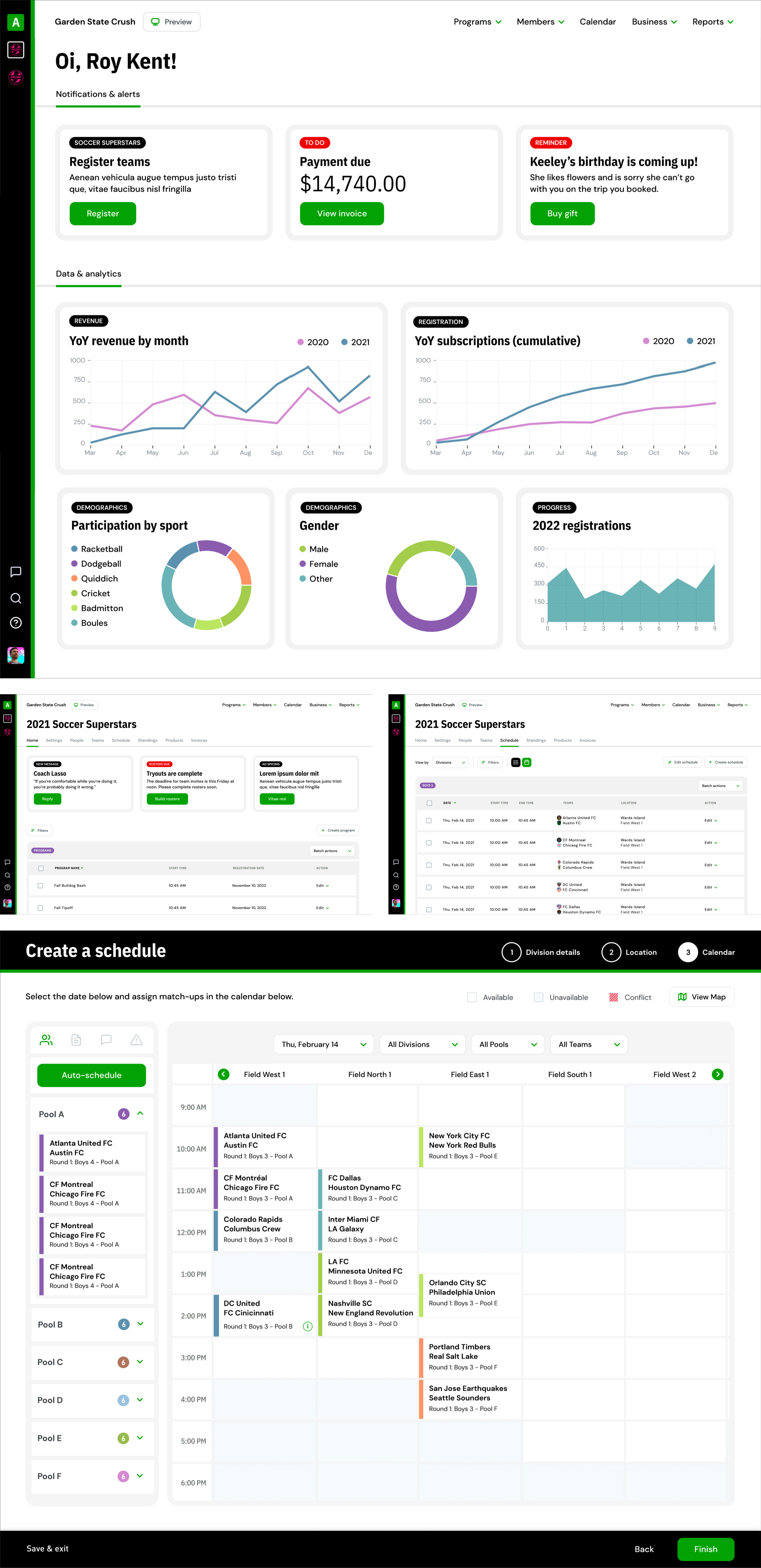
Over the past ten years, the platform has have been cobbled together, with features and customizations layered onto the framework like sediment at the bottom of a river with each new monsoon season.
As a result, the platform looks and feels long in the tooth. From an engineering perspective, it’s a monolithic beast that’s brittle to the touch. Innovation is virtually impossible as the structure upon which the platform is built has become so calcified that new features cannot be built up on it. This not only hampers development but also design.
THE SOLUTION
A completely redesigned experience (both front-end and back-end) with an eye towards modernity and simplicity.
A redesigned management platform to engage a new generation of youth-sports organizers.
Audit.
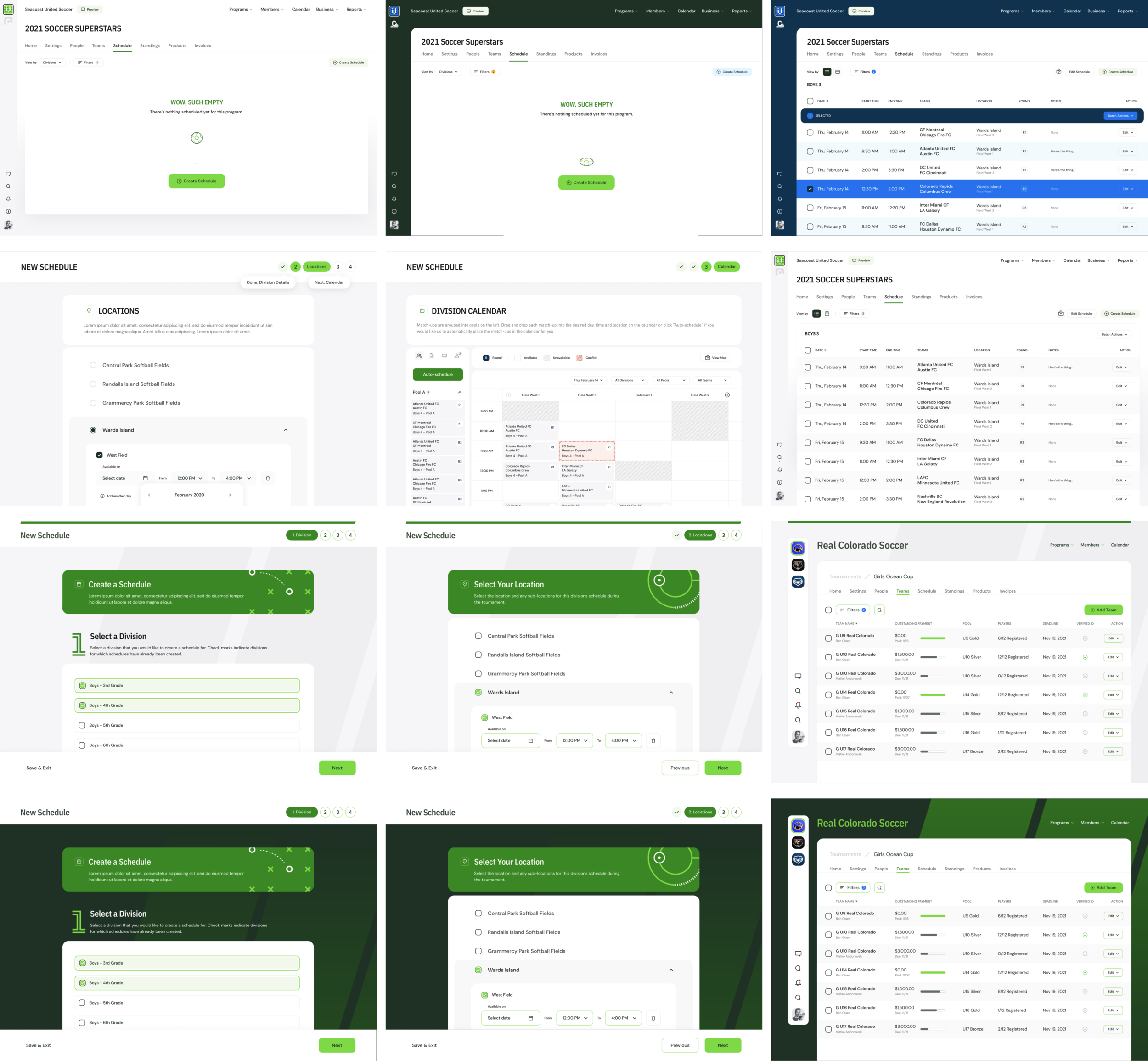
The existing platform had been cobbled together over the span of almost ten years without a head of product nor a dedicated designer. While the platform is powerful in what it supports—and is highly configurable—many pages had become a dense vomit of checkboxes, lacking in information hierarchy and a sense of how to navigate through the system.
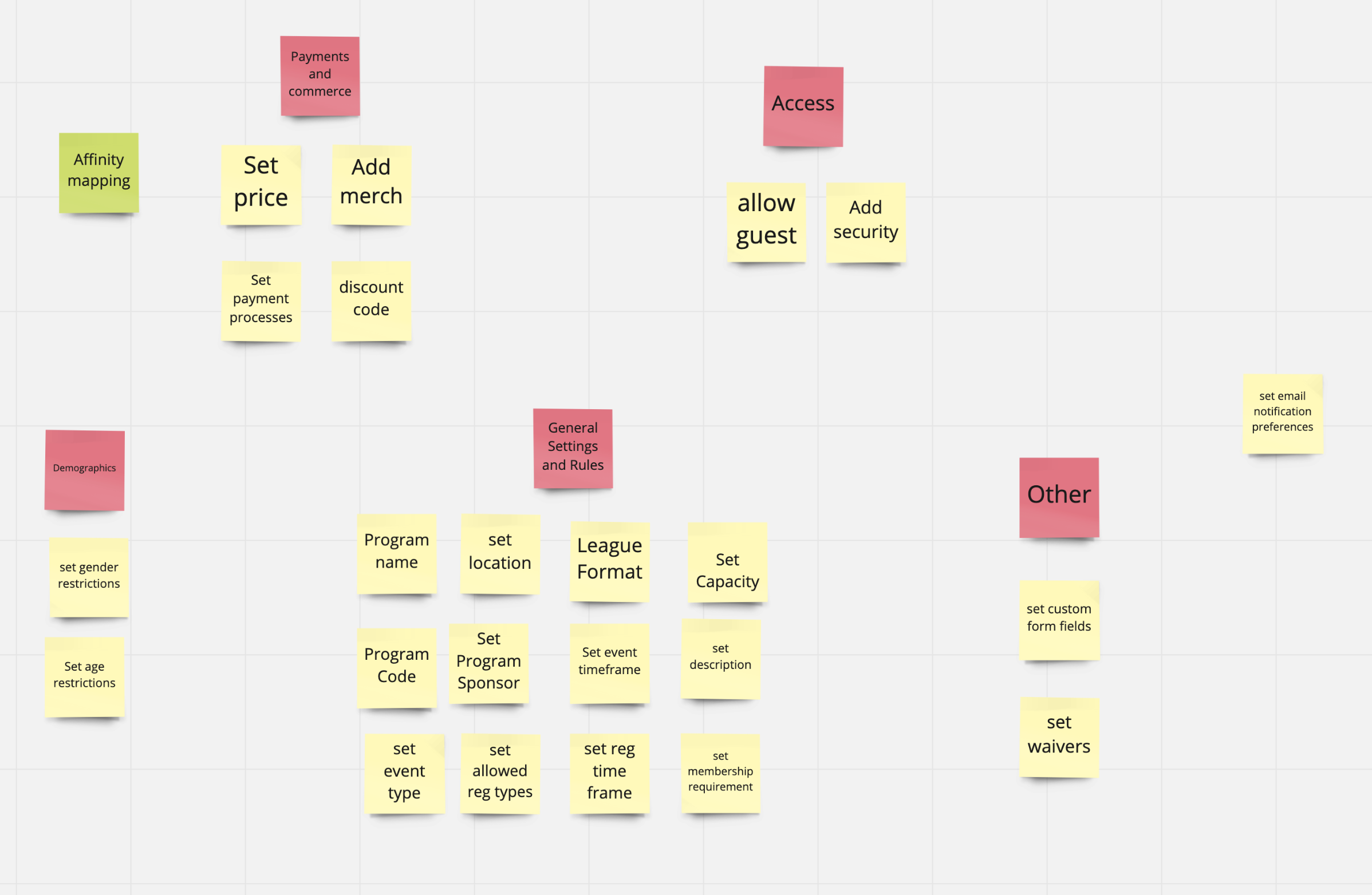
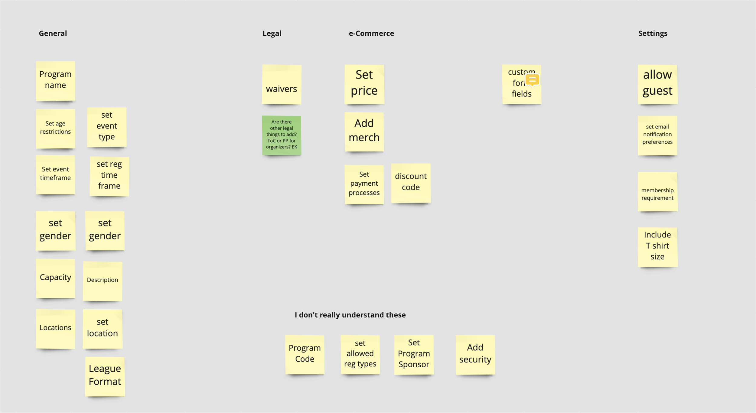
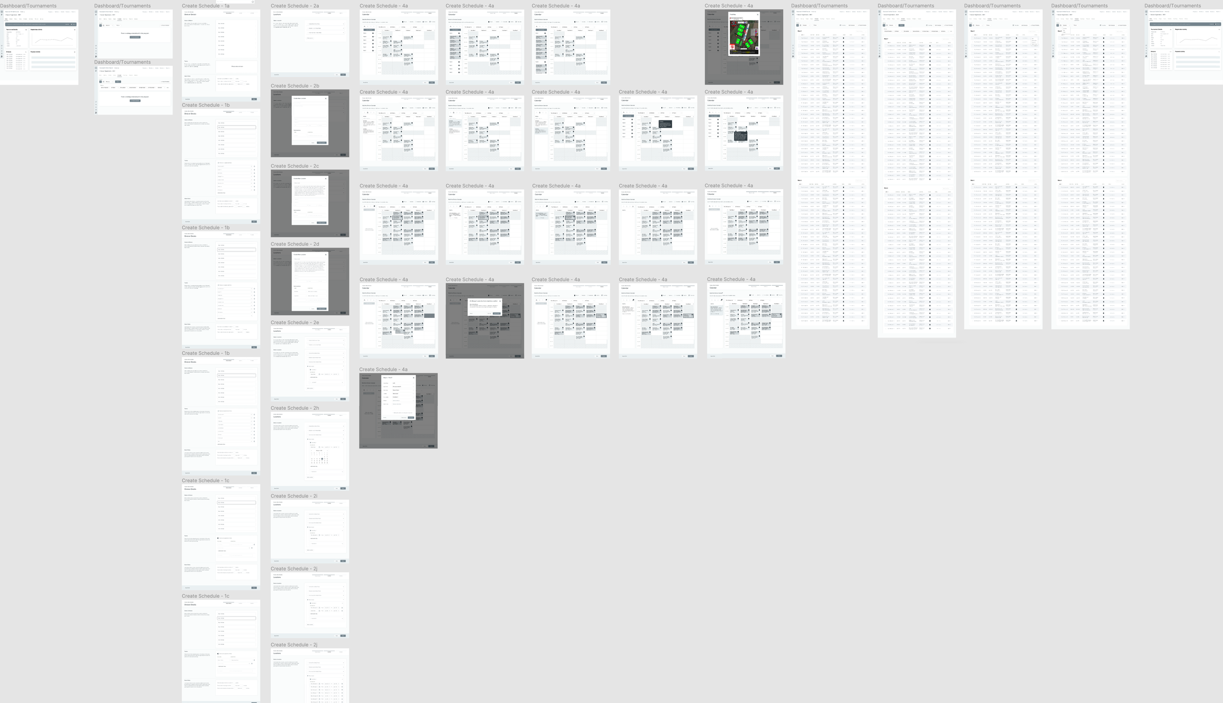
Card sorting and user journey mapping.
As we began to look at the platform, we began to break it down into component parts, from registration to the various different program types.
We began by stepping back and looking at what comprised each component, using card sorting to help us understand how pieces of each component grouped together, and user journey mapping to help us understand how one might navigate through the experience.

Wireframing.
We engaged and outside design partner to augment our team and work with the product managers and myself on wireframes. Thrice weekly works-in-progress sessions let us come together to review and offer feedback. Ongoing conversations were conducted asynchronously on slack.

Testing & feedback.
Once we had a set of wireframes in place, we began testing them with various groups of organizers, both those who use LeagueApps and those who don’t to get a sense of how different audiences would react to the wireframed proposals.

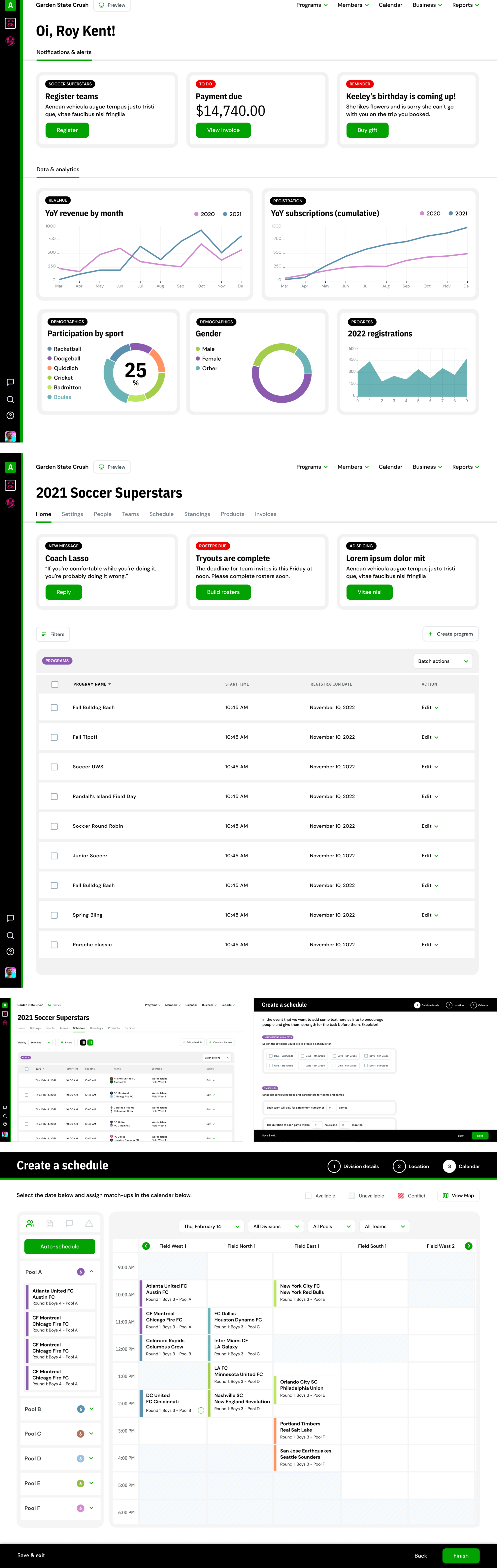
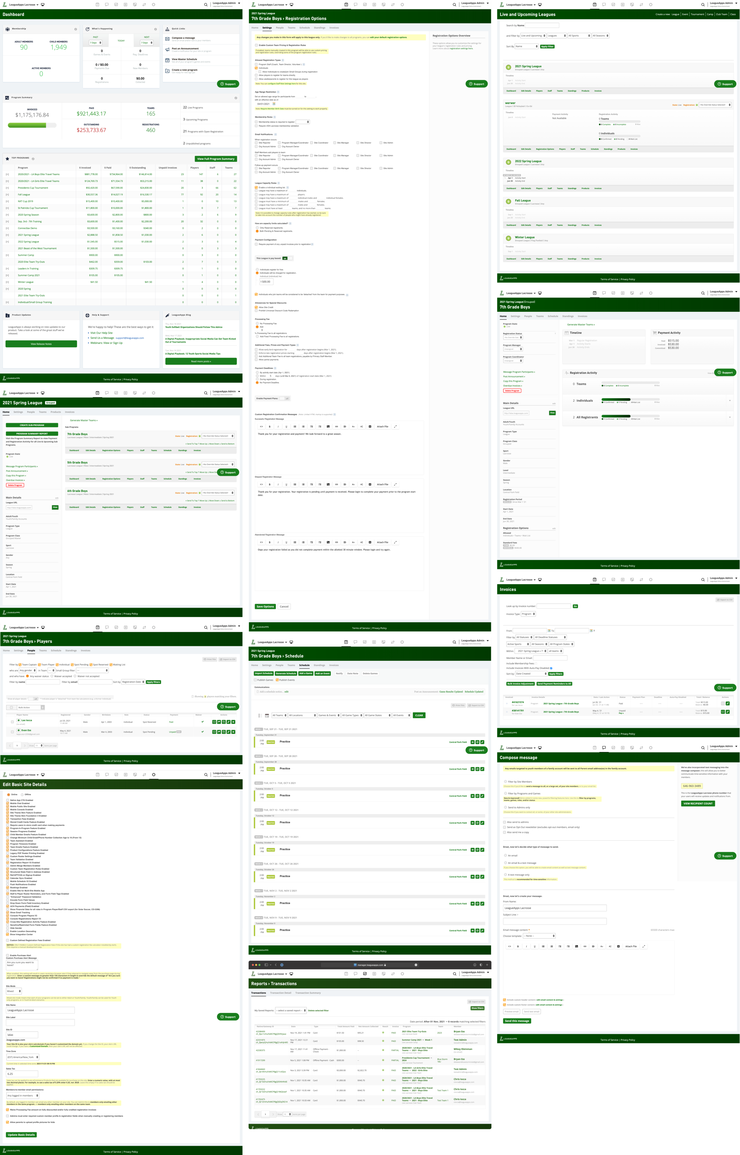
UI design, take one.
Our design partner began working on the UI design, providing typography and initial concepts. Unfortunately, while the UX work and interviews were thorough and considered, the UI design fell short. At times, the designs looked more like marketing site designs than application design.
UI design, take two
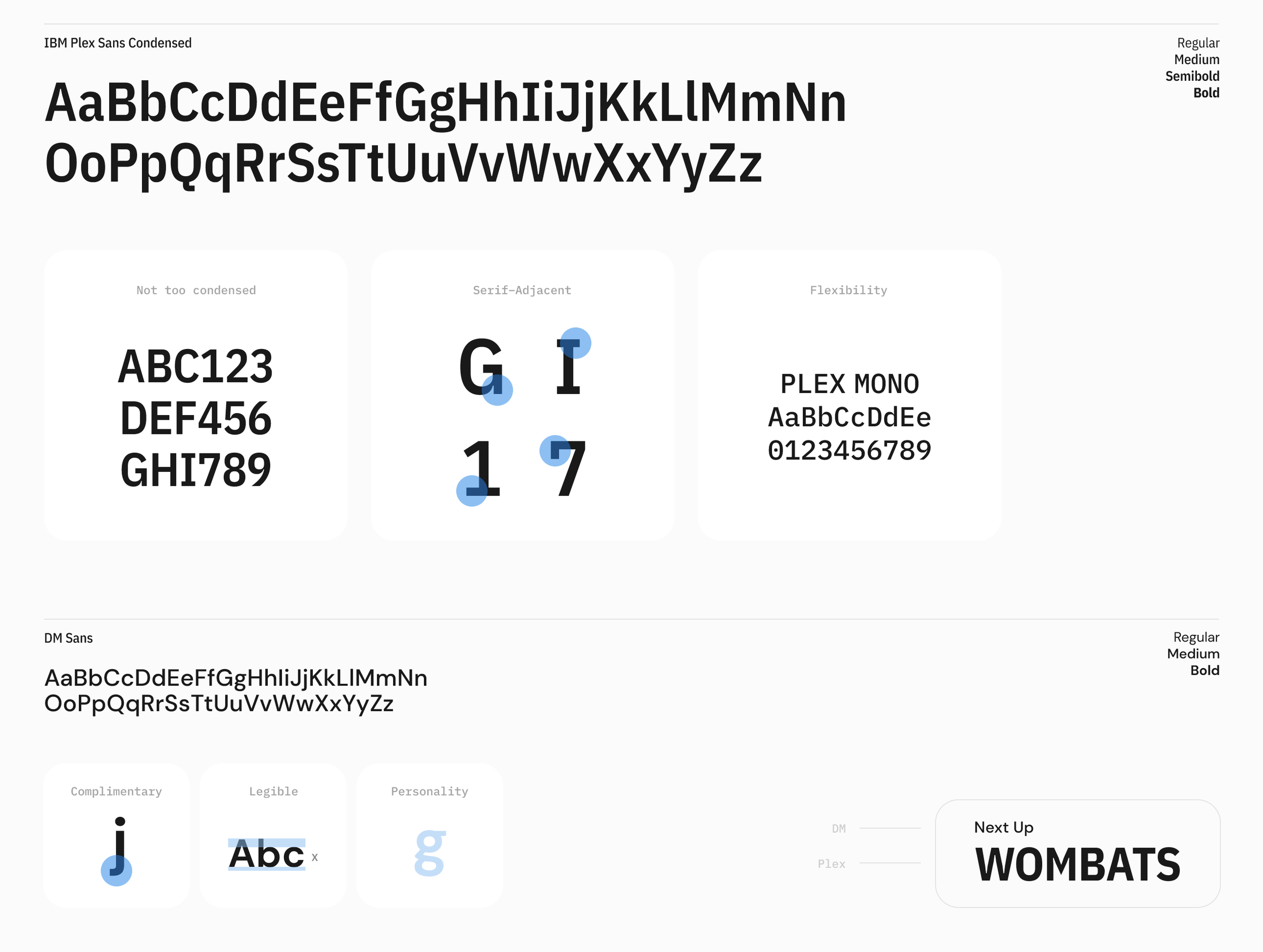
We decided to take the UI design in-house, leveraging the ideas represented in the wireframes, and the typography provided by the agency. Overall, we were looking to bring lightness and modernity to the platform, increasing the white space and giving our users room to breathe.
We had also began to think about the end user (member) experience while we were working on the organizer platform and realized that we could leverage the same platform, displaying information based on role. As such, we began to think about a unified experience, where all aspects of the end-to-end platform would share design elements and a point of view. The experiences wouldn’t have to be in lock-step, but they would closely rhyme.