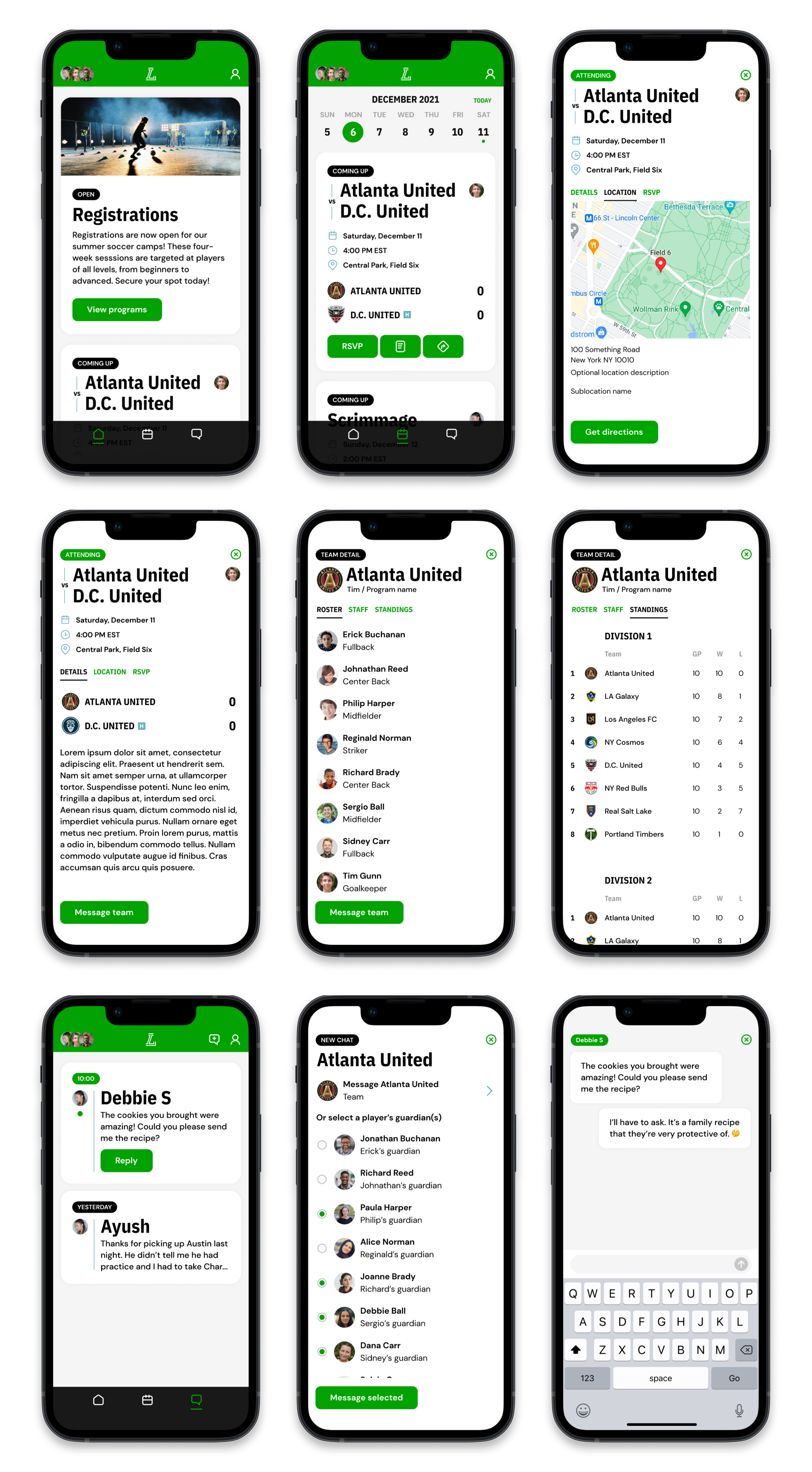
A mobile app optimized to help parents spend time watching their kids on the field, not their screens.
THE PROBLEM
While LeagueApps had spent close to 10 years working on a platform for organizers to create, schedule, and register people for youth-sports programs, they had spent very little effort on the experience for registered users (members).
By this point, members and coaches were clamoring for a mobile solution for communications and event management, and many were bifurcating their experiences (or taking their business elsewhere) to platforms that had mobile solutions to their needs.
THE SOLUTION
A native mobile app experience designed to give parents the information they need when they need it so they can act quickly and get back to their busy schedules.

Analysis and research.
First we looked at the main competitors to see what they offered. We also listened to organizers and end users to see what they would like in a mobile experience.

User journeys, stories, and sitemaps.
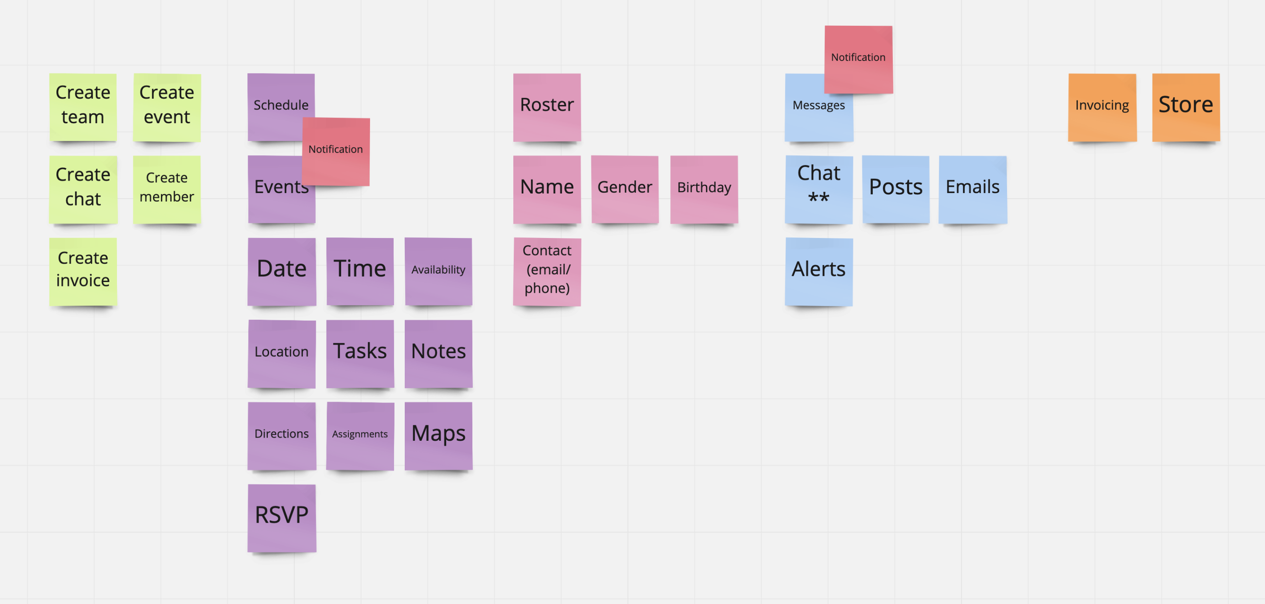
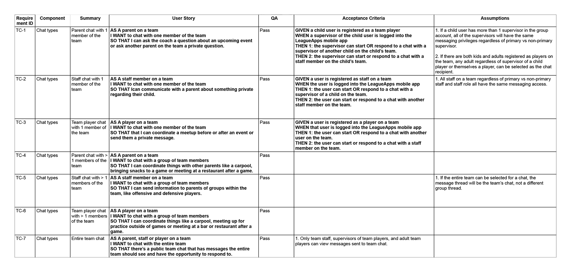
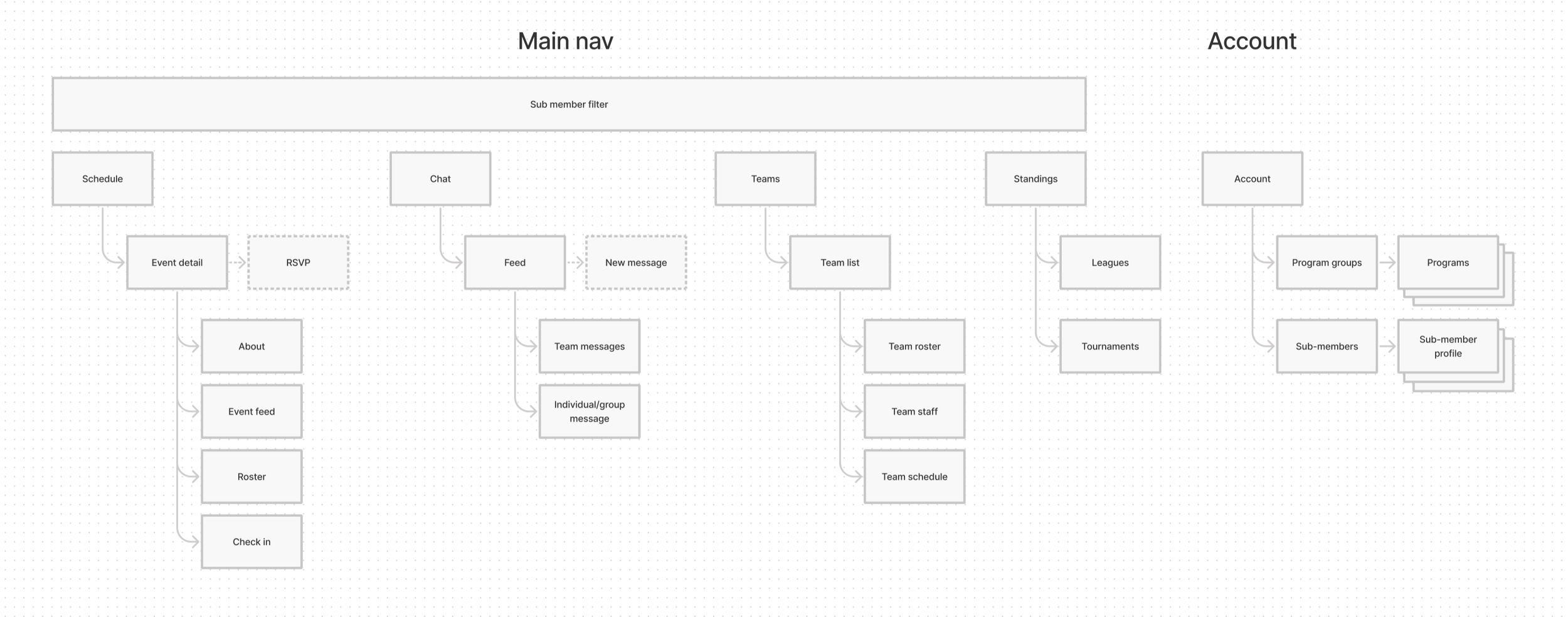
Next, we charted user journeys and created stories from which to work. From there, we developed a site map and began design.

Take one:
All things being equal.
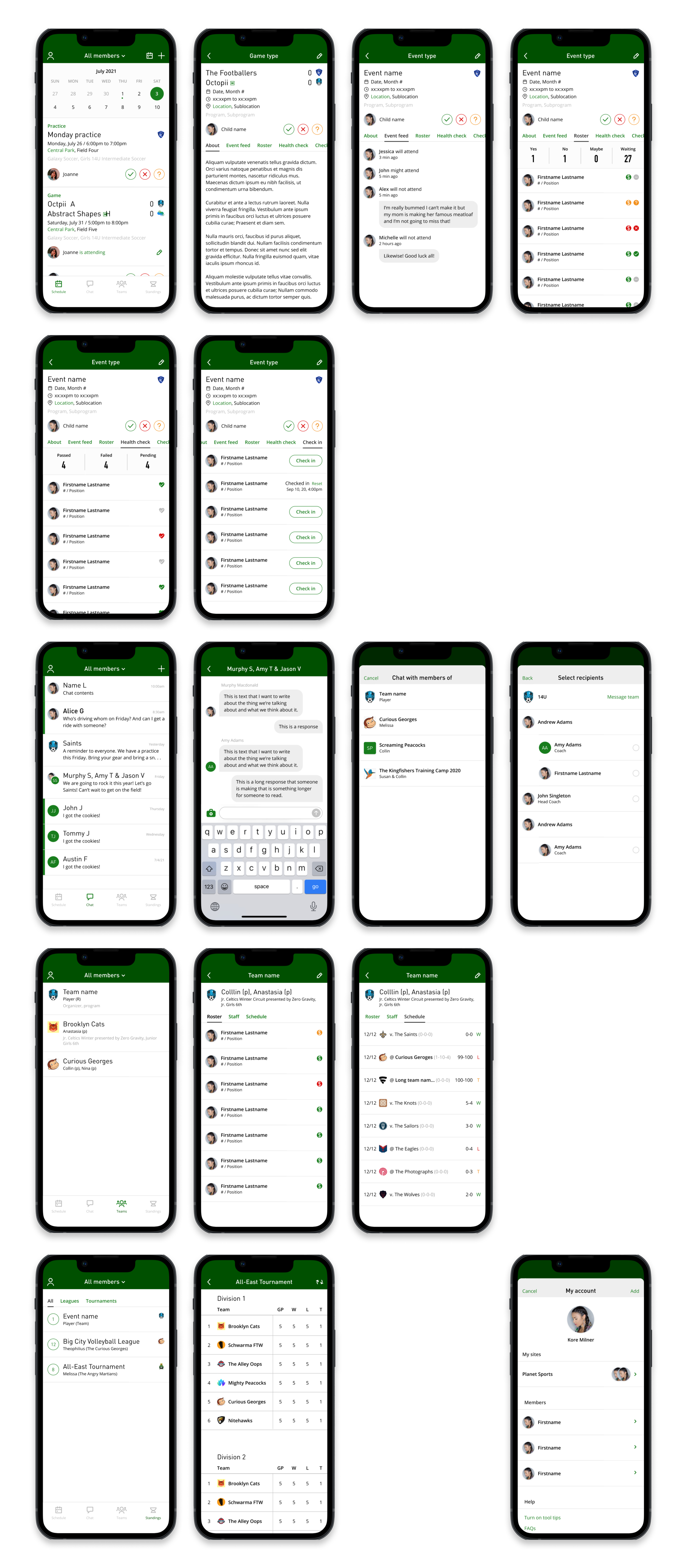
Our first design took all the information we had gathered and put it in an app in an effort to match our nearest competitor, surfacing all the different elements

Testing, feedback, and exploration.
As we observed people using the app and continued to elicit feedback via user interviews and moderated & unmoderated testing, we kept hearing that the main actions people wanted were communications and event reminders/management. The rest of the information was secondary to our primary users.
We took a minute to rethink what the problems are and what we were trying to solve and to look at the two main use cases/problems people were encountering. We also took some time to look at apps in other spaces to see what we could learn from them. This lead to a few new explorations.
“If LeagueApps had a reliable app I’d switch back tomorrow.”

Refocus
We found we liked apps that foregrounded primary interactions to the extent that other actions were hidden; apps that had a point of view on what actions you were supposed to take and did everything in their power to help you achieve the main goal.
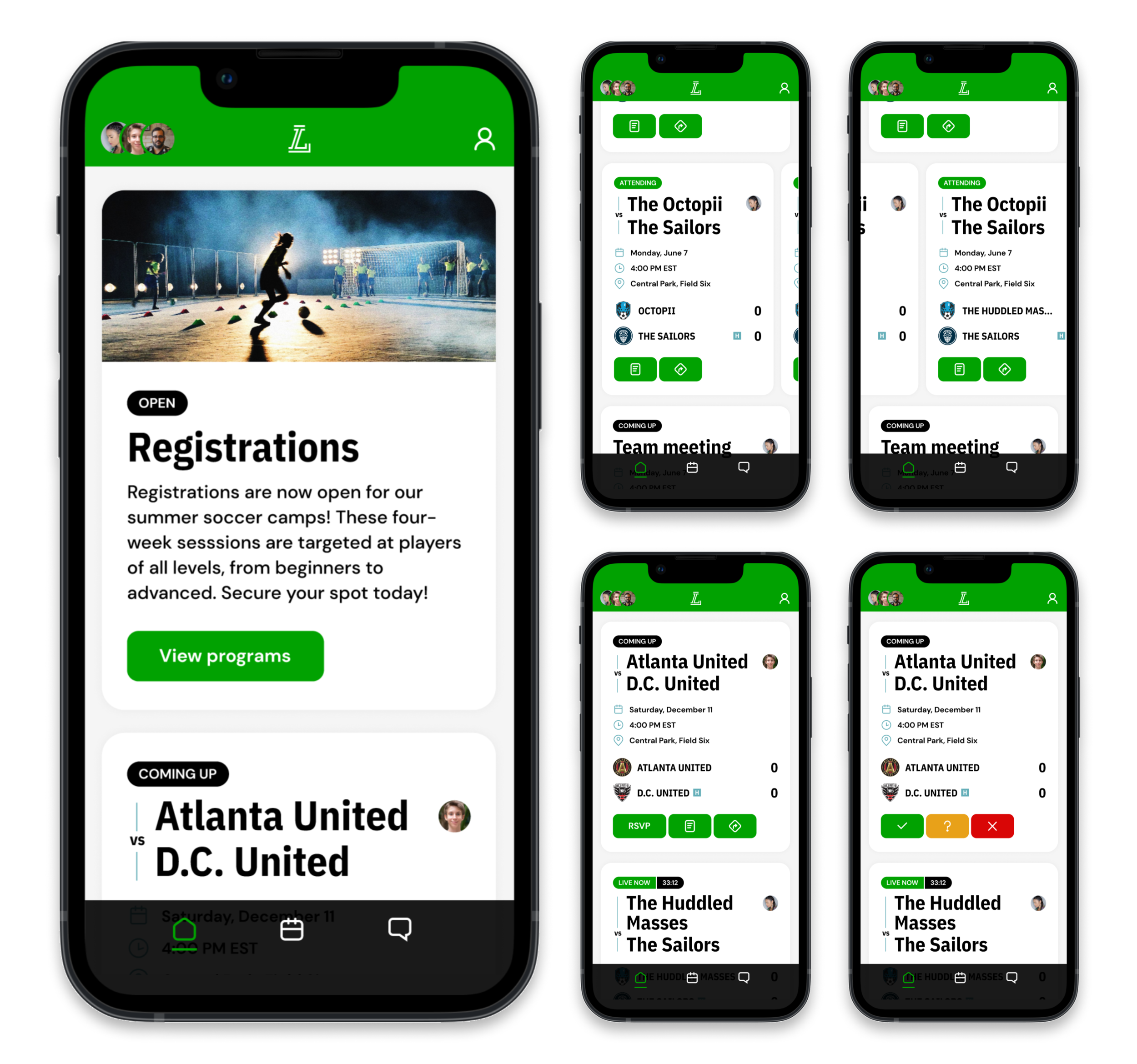
To that point, we focused on the two main use cases we kept hearing about: seeing events and chatting. To help forward the idea of helping users do the one thing they most need to do when they need to do it, we added a feed which showed the most relevant and timely action the user had to take whenever they launched the app.
The team and standing information from the original design remain in the app, but you users discover that information contextually, by tapping on teams within event cards.
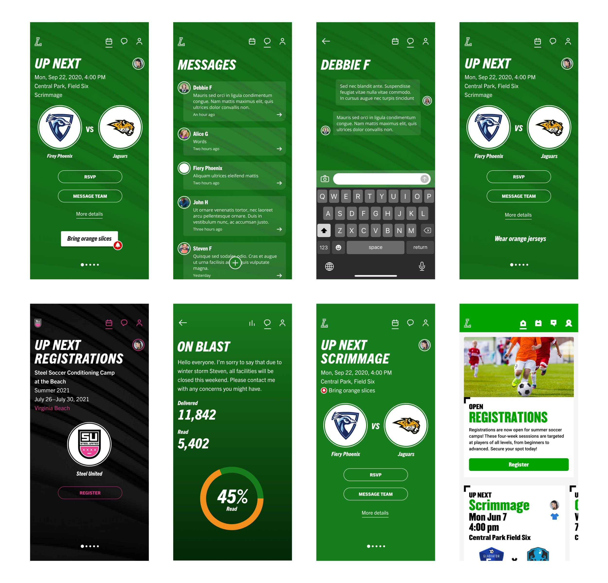
At the same time we looked at the fonts and colors, and started exploring ideas to make the app look more modern and friendly, as compared to the somewhat staid initial iteration.

Rebrand. Refine
Retest.
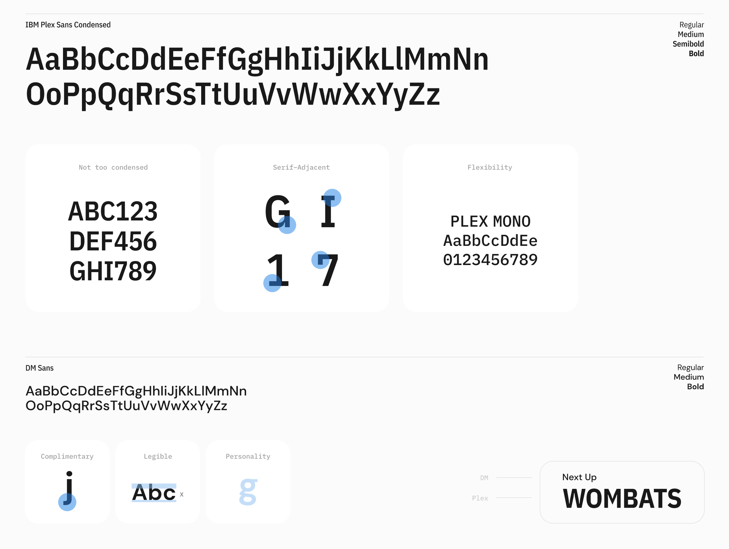
While we were working on the mobile app, we were also working on a redesign of the organizer management platform, which included updated typography. We decided that it would make sense from a platform perspective to marry the look and feel of the platforms. This also fed into our nascent member strategy, and so we took the management platform work being done and adapted it to the mobile app.
Simultaneously, we continued prototyping and conducing both moderated and unmoderated tests on the updated designs.

Design system.
As we finalized the first round of designs, we created a design system around the various components and typefaces to aid in future designs and to help new designers get a jump start on their tasks.

