A mobile app re-imagined to broaden audience participation and increase user engagement.
THE PROBLEM
While Universal Tennis was the standard by which college and pro-am players measured themselves, there was a large segment of the tennis-playing and tennis-enthusiast market that remained unaddressed by UT’s level-based play ethos.
UT wanted to both broaden audience reach, and help more people engage with their peers across the tennis-playing populace.
THE SOLUTION
A re-imagined native mobile app experience with an eye towards social engagement and helping players find opportunities to play more often and play with people who play at their level.
Updated design for consistency.
The original design of the app was inconsistent and lacking in design systems, patterns, and information hierarchy.
The first thing we did was to look at the app holistically and establish some basic design rules. We introduced a design system, brought consistency to core app elements, and made to lead the user’s eye from the most important elements to least, reading down the screen.
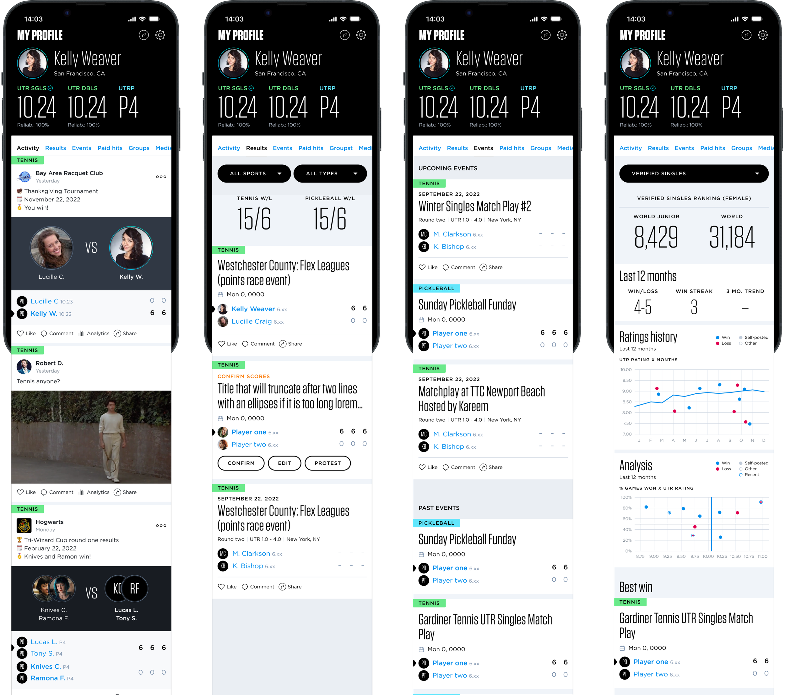
We also sough to highlight the rating on the home page as it’s the biggest product differentiator, and created a consistent treatment for it across the home and profile screens.

An interactive data strip.
Leaning into the ratings strip, we thought about how we could surface additional data to encourage people to be more engaged with the app and spend more time out on the courts or otherwise improve their physical fitness through tennis.
Challenges and trophies were considered, with the strip expanding to show progress and rewards.
An active & interactive home screen.
We introduced a feed on the home screen that would showcase the player’s activities along with the activities of the people they engage with and of their communities, with the intent of bringing them closer to the tennis communities they already belong to, while introducing them to nearby communities of which they may want to be a part.
A more powerful profile.
Using our tabbed navigation patterns, we surfaced information that was otherwise buried on the profile page, and used the opportunity to expand upon the information shown within each sub-section represented.
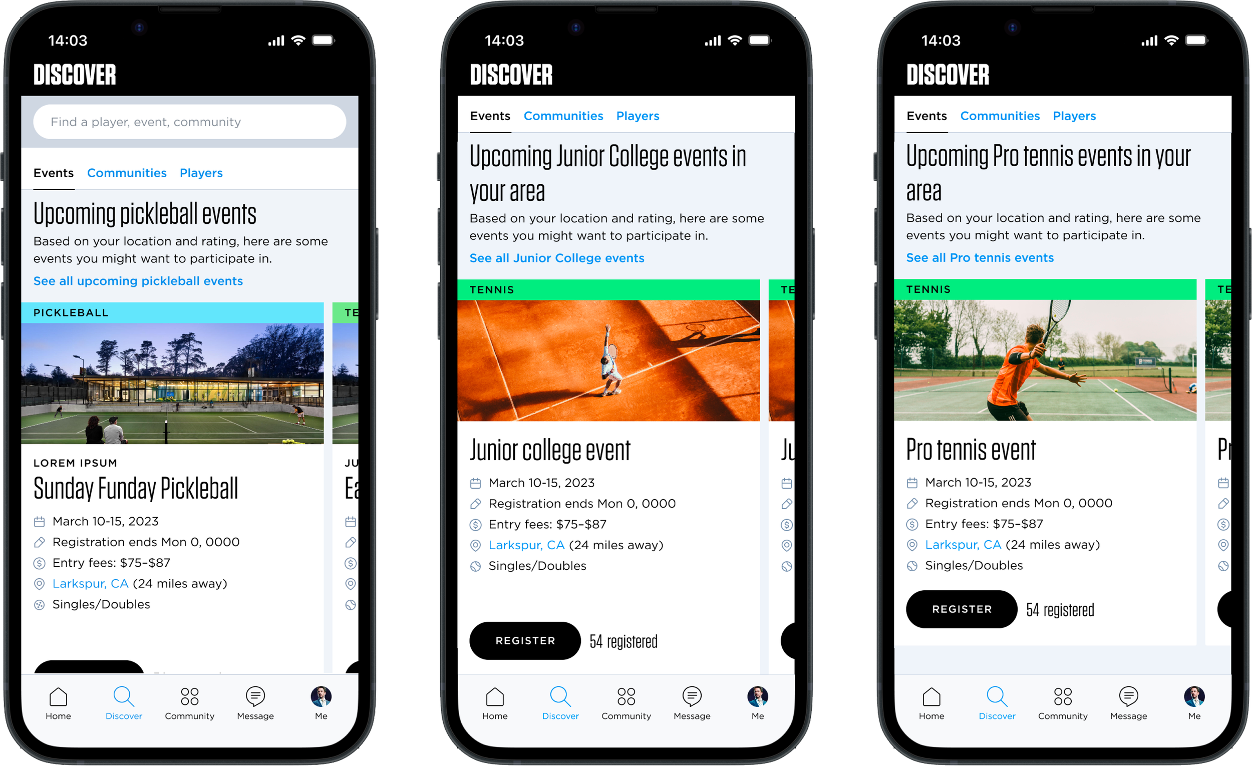
Improved discovery.
Whereas the original app required a user to know what category they wanted to search in, we broaden the search to be all-encompassing, introducing filtering after the initial search is engaged.
Additionally, we surfaced items we felt they might be most interested in right on the landing page, using the space in a more dynamic and engaging way.
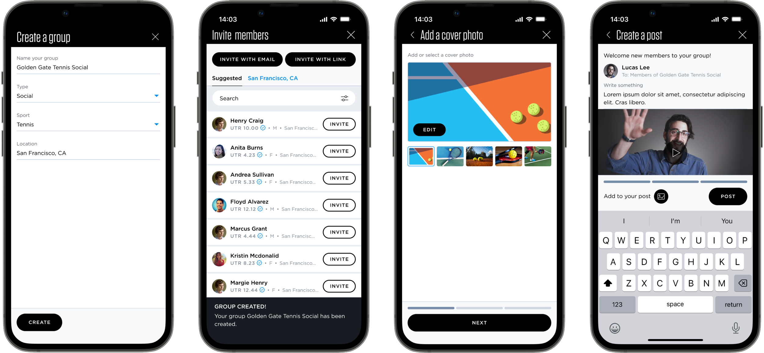
Introducing communities.
As part of the drive to be more inclusive and encourage more people to interact with their tennis communities, we broadened the opportunities for people to create groups and events within the platform. Our intent is to help people organize themselves and the people around them and to help them promote events both on and off the court.
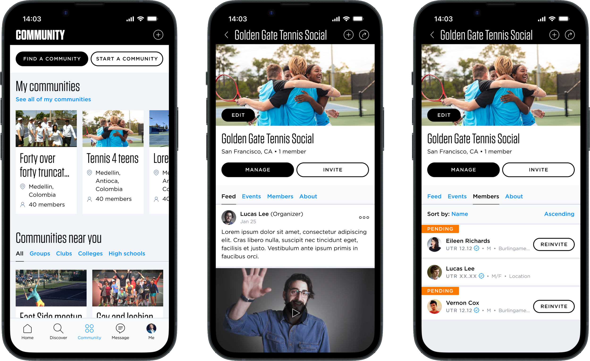
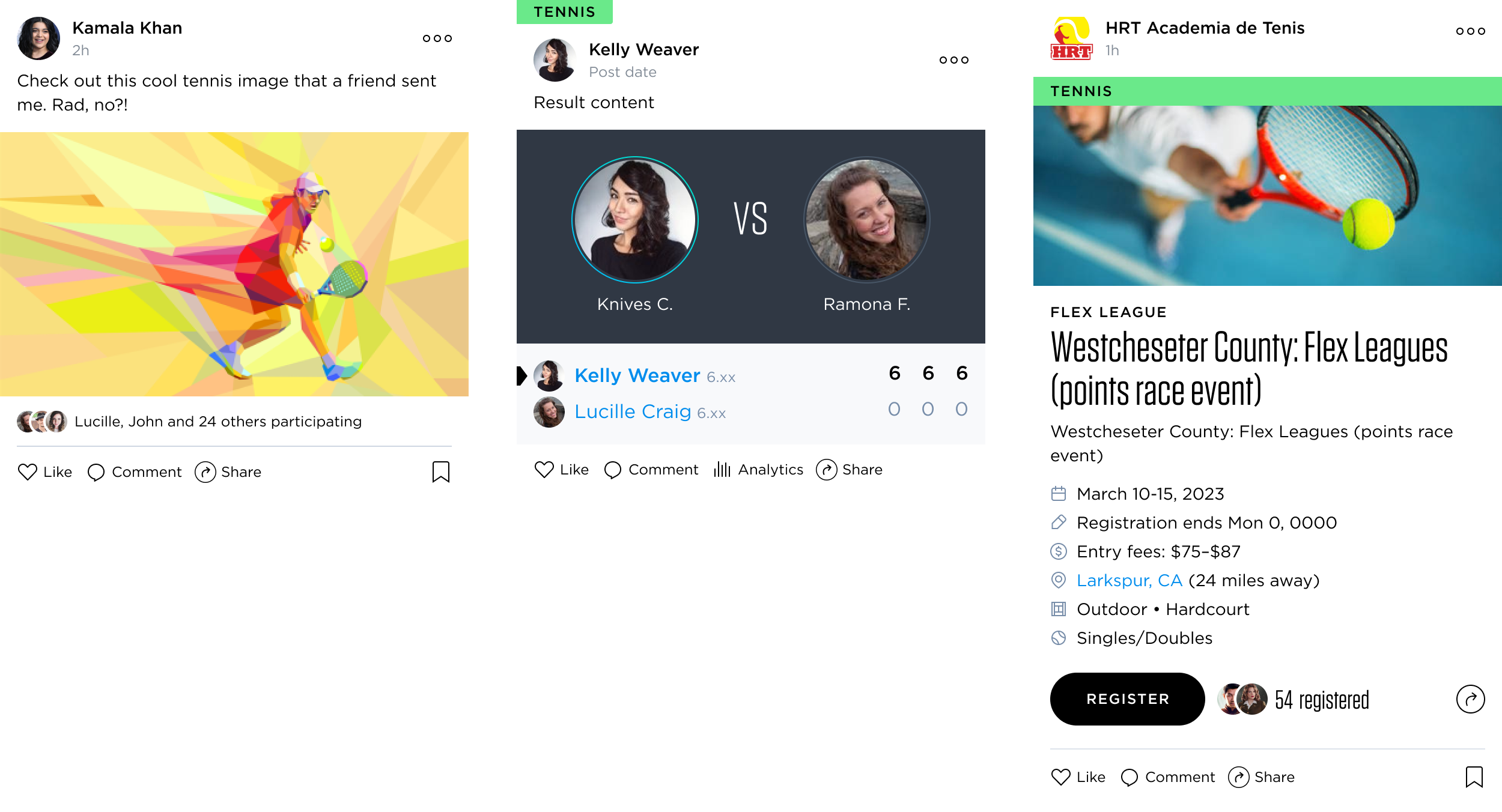
Social interactions.
Introducing social interactions to cards (likes, comments, sharing) we opened up the app to
Robust design patterns and a documented design system.
We created components and patterns to be reused across and within screens, including a tabbed navigation, event and match cards,
Ensuring such things as matchups, detailed information, headers, and subheaders would have a consistent presence across the app.


